Willbert EV
EV charging station interface with a white-label system
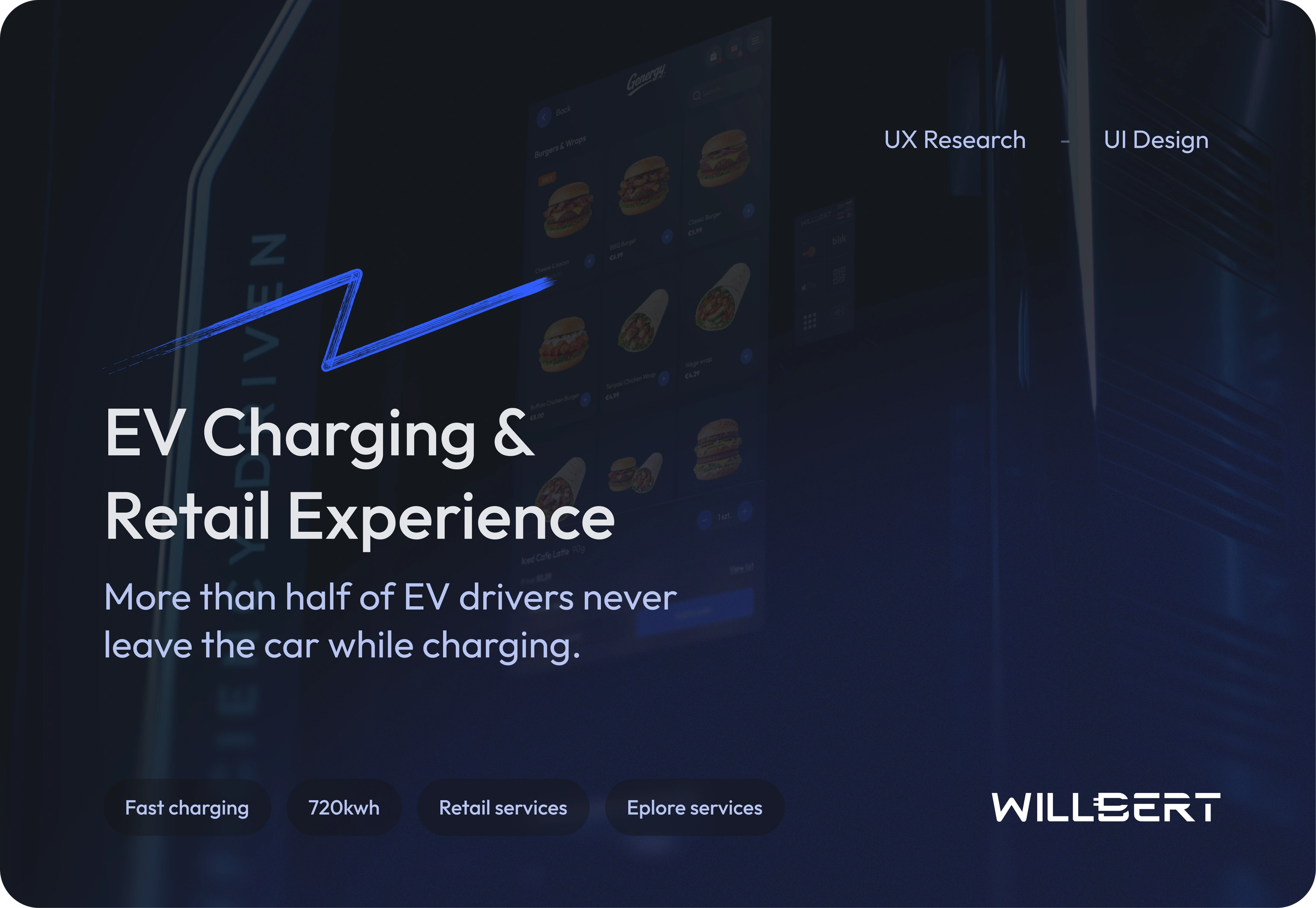
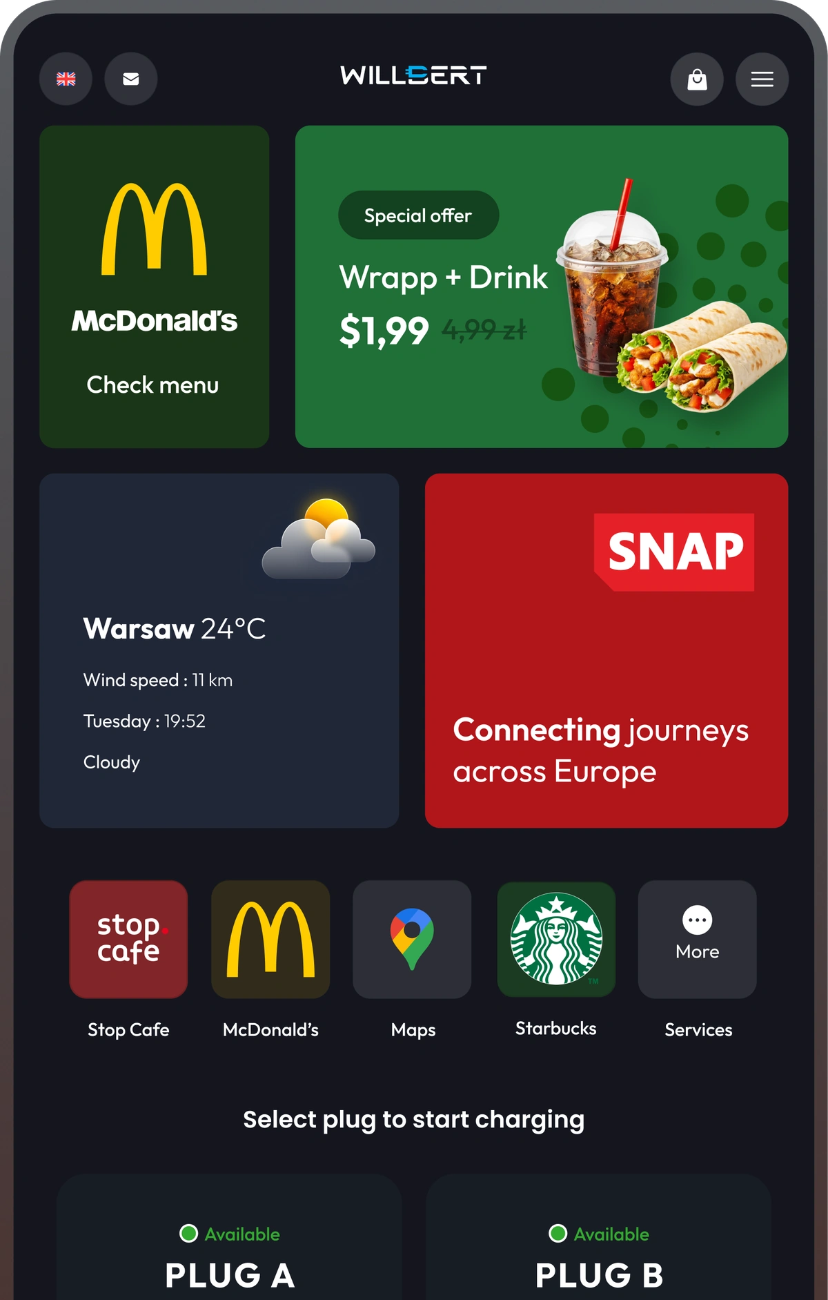
Retailers buy high-power chargers expecting shop conversion — and get parked cars. The charger screen is the only moment the driver is guaranteed to look at the operator’s product.
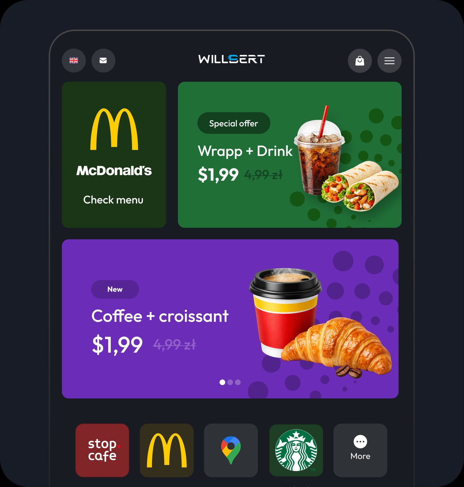
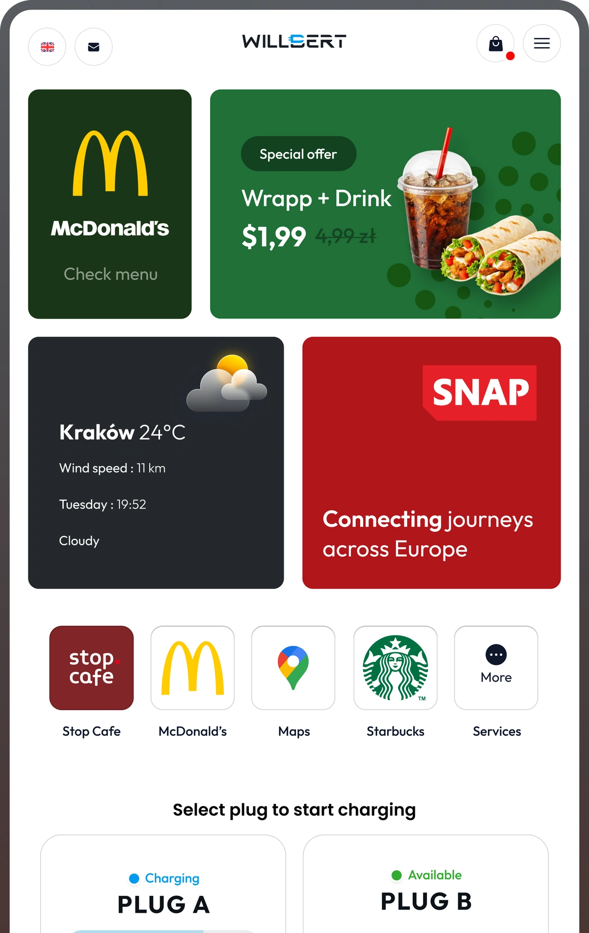
The offer loads before the car does
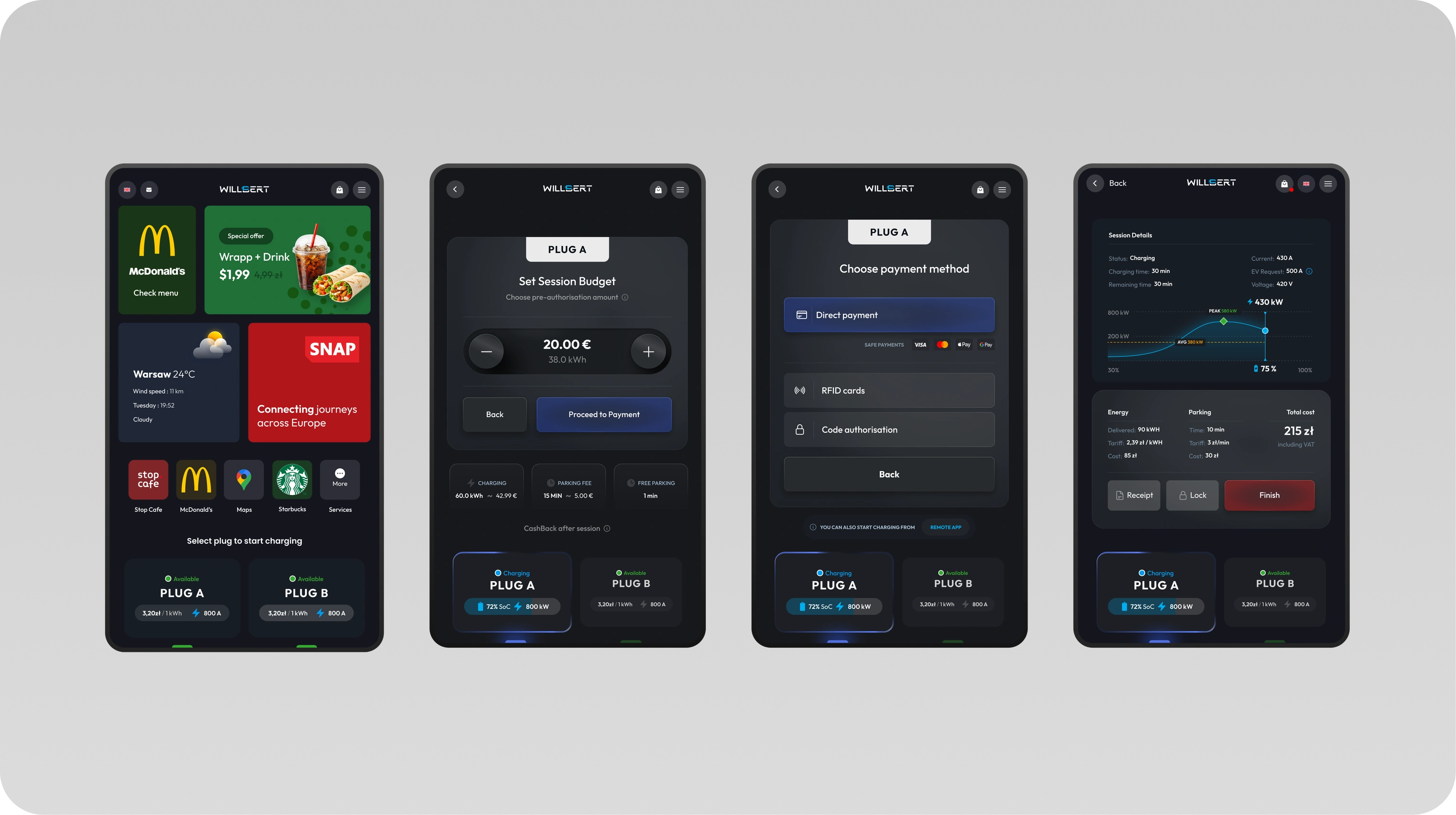
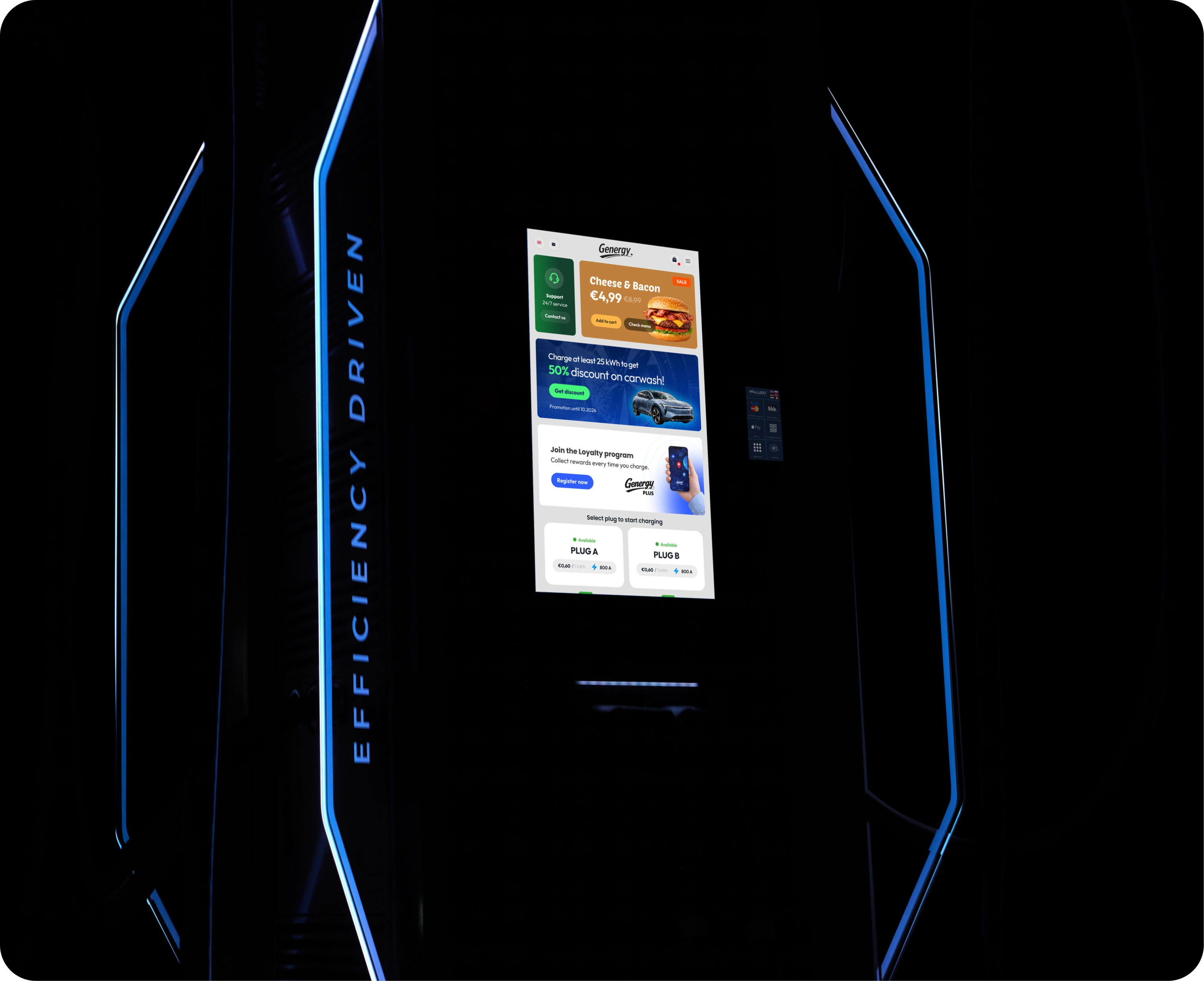
Drivers see the retail offer the moment they walk up — no session required. Every screen is a storefront, turning charging time into revenue from the first glance.

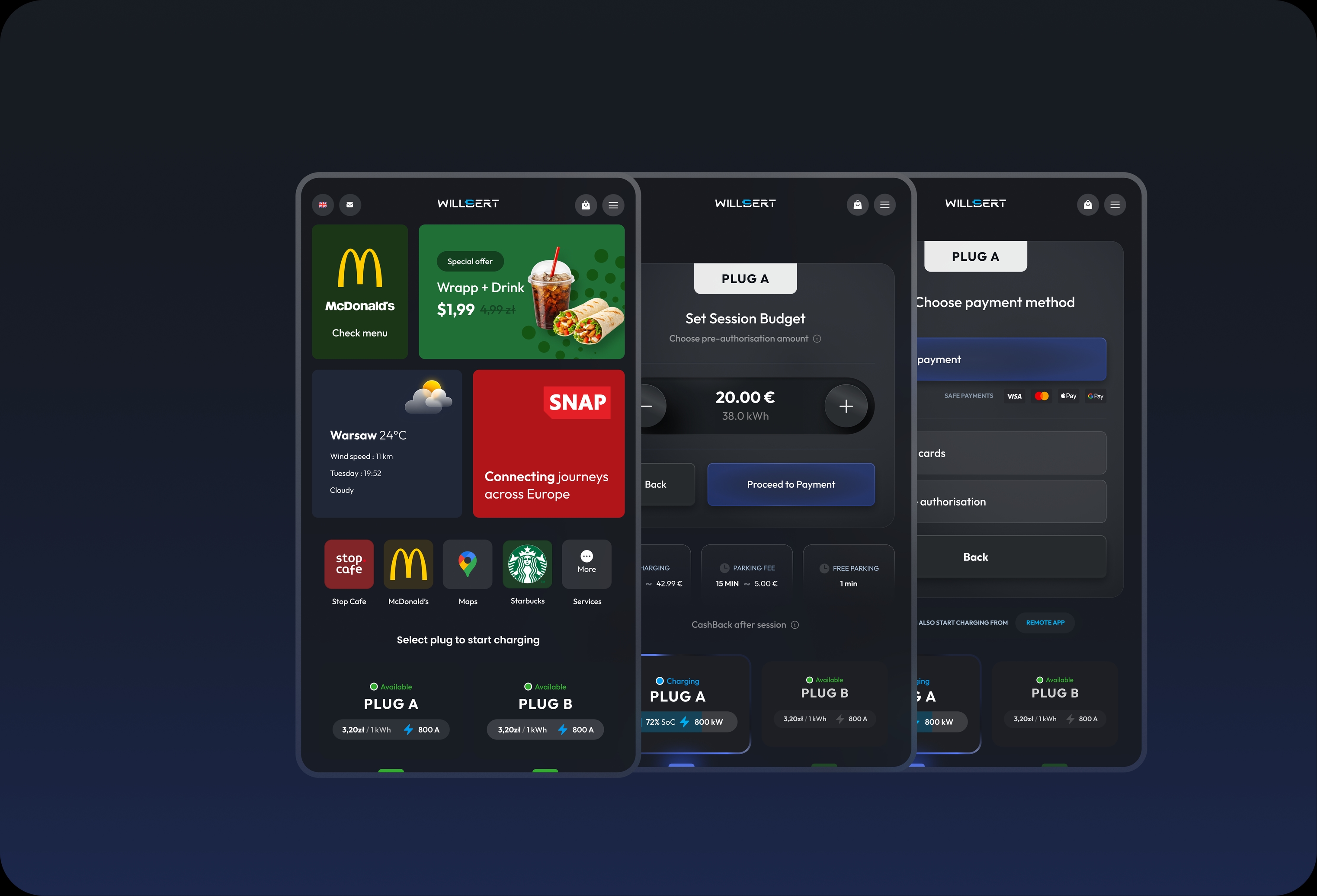
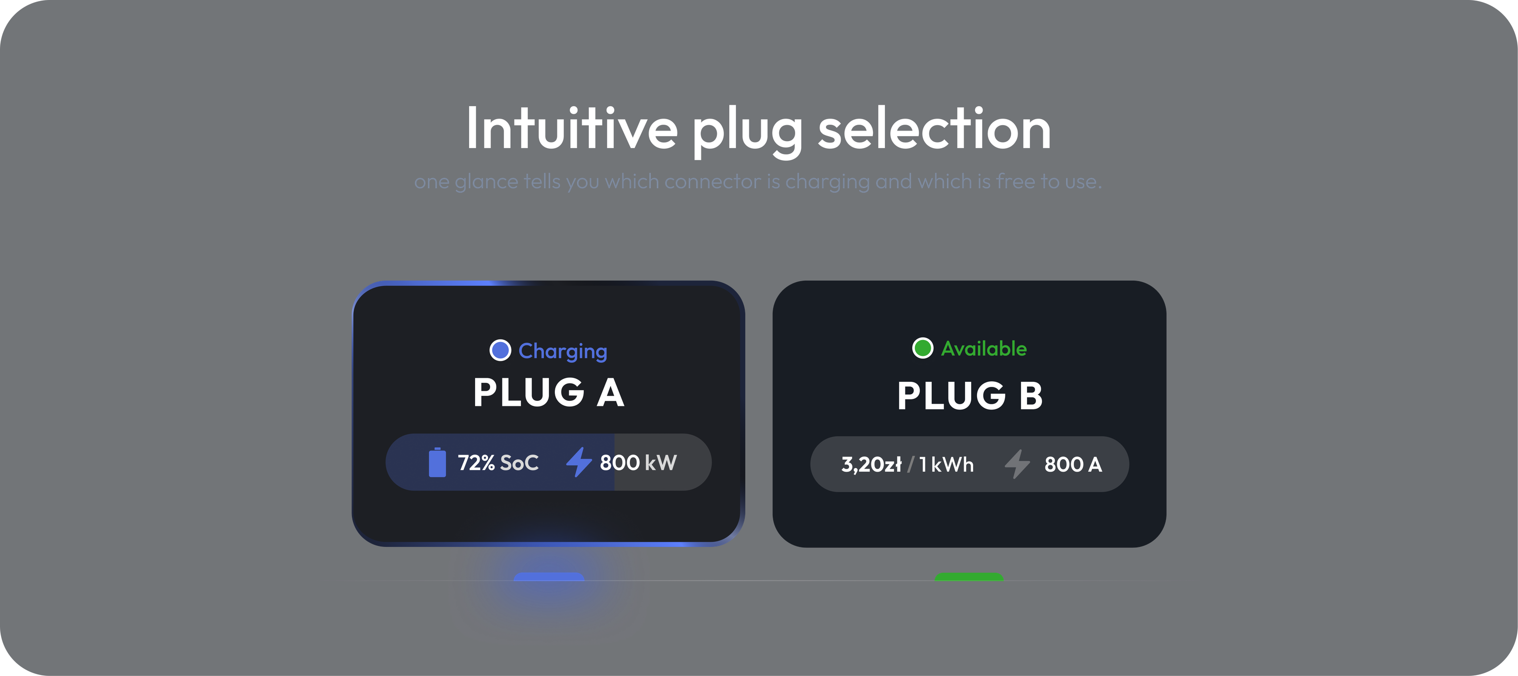
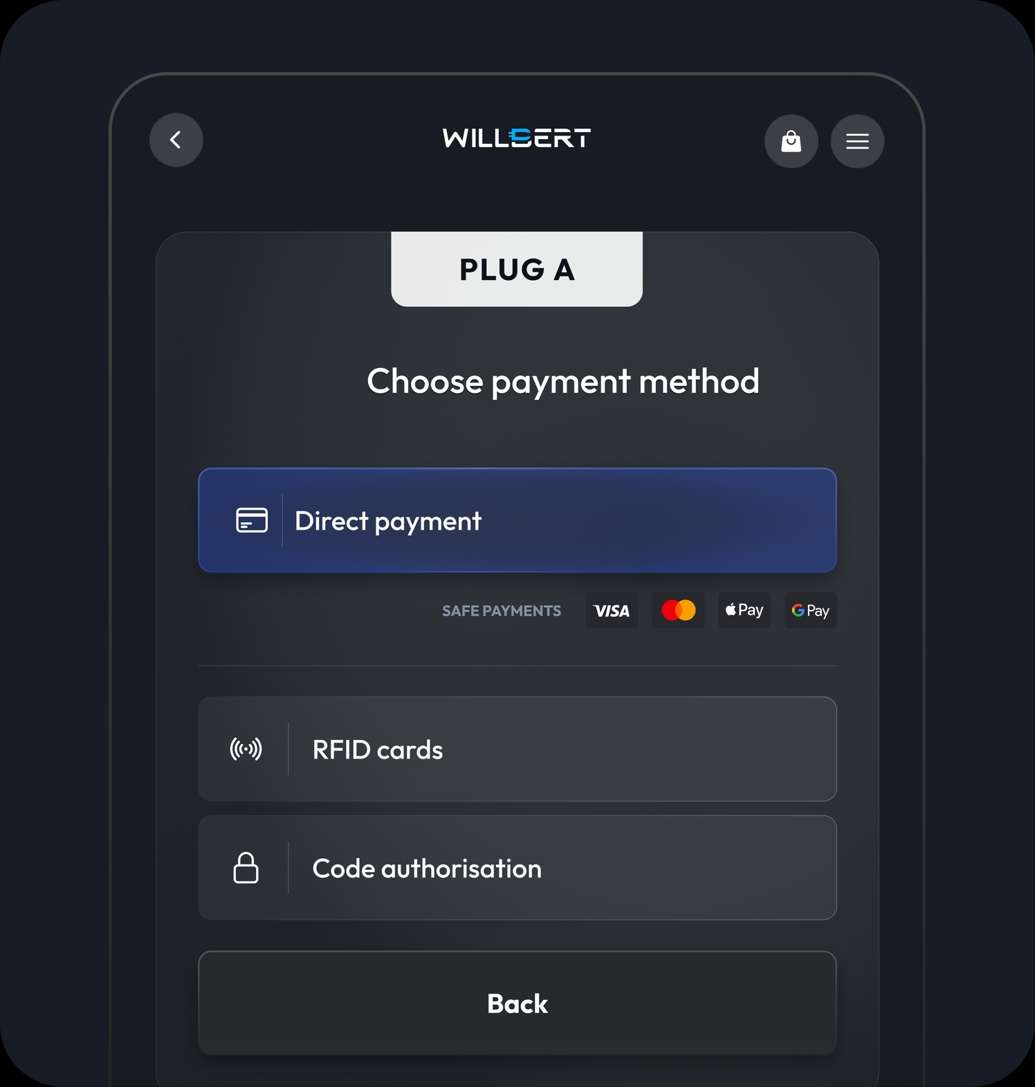
Three intuitive ways to start a session
Payment card, RFID or one-time code. The UX guides the user step-by-step, and all options are immediately visible — zero frustration, even for first-time car chargers.


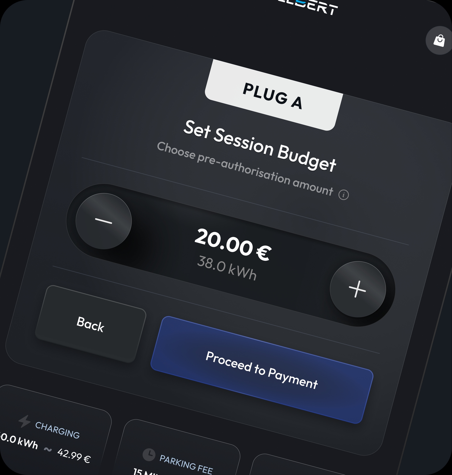
Full cost control before you plug in
The driver caps the amount before plugging in and sees it converted to kWh in real time. Charging and parking estimates upfront, automatic stop at the limit — no surprises on the receipt.
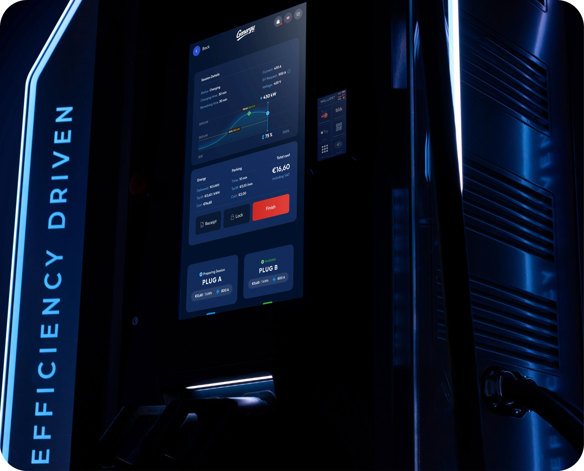
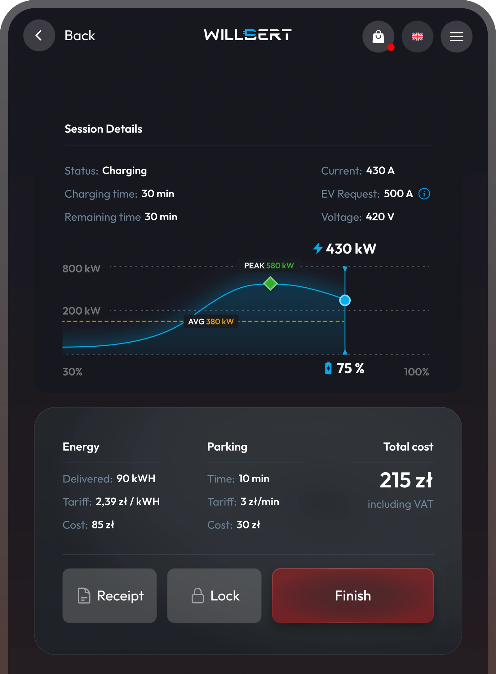
Numbers that make sense
Everything a driver wants to know, live on one screen: charging speed, time left and a bill that builds in the open.
Designed for daylight and midnight
One dark theme, tested at both extremes: deep contrast that cuts through noon glare and doesn’t blind at 3 a.m.
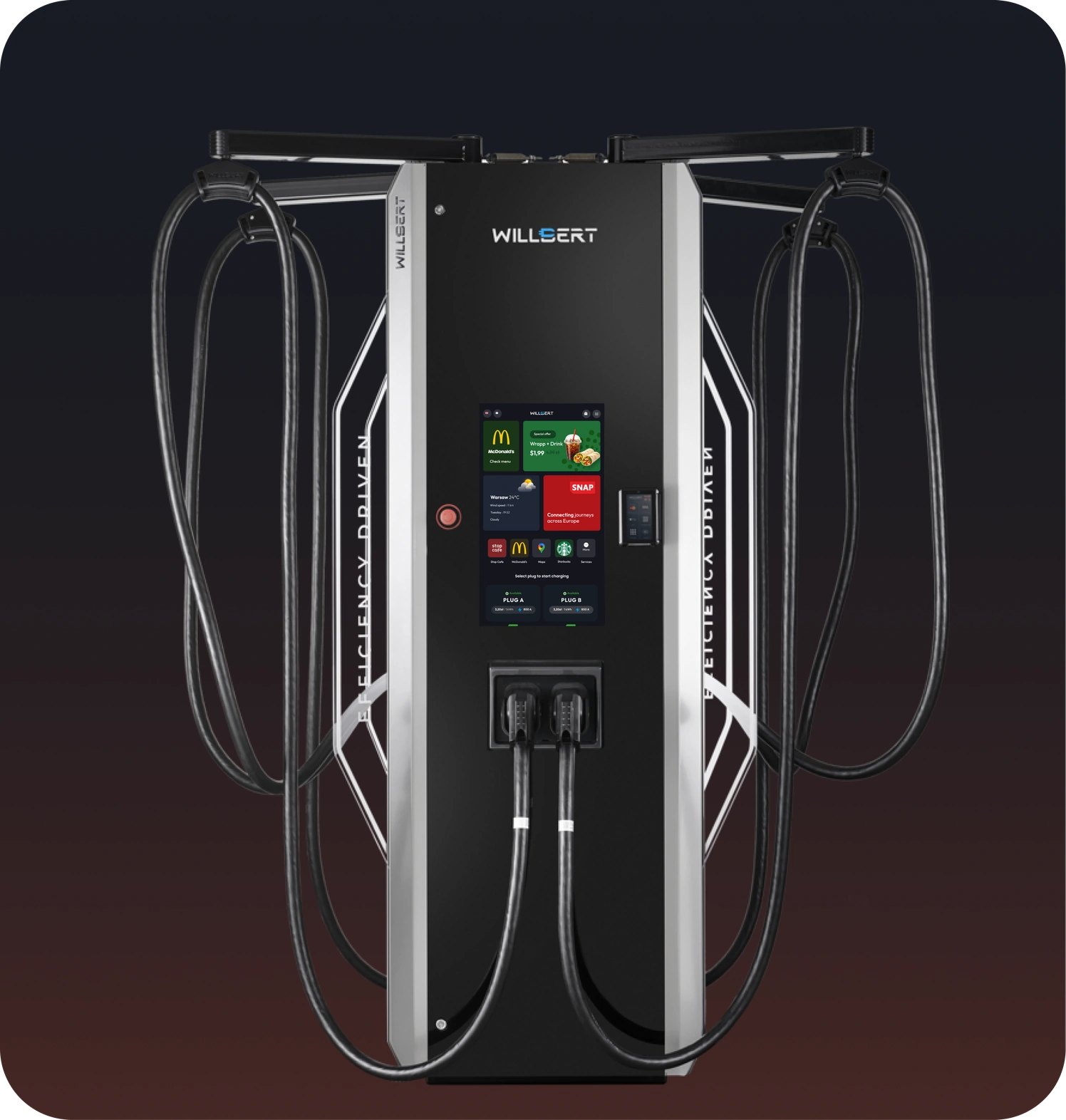
The machine behind the experience
Four cables, two screens, one pillar. Modular from 60 to 720 kW — the same machine serves a city car and an electric truck.
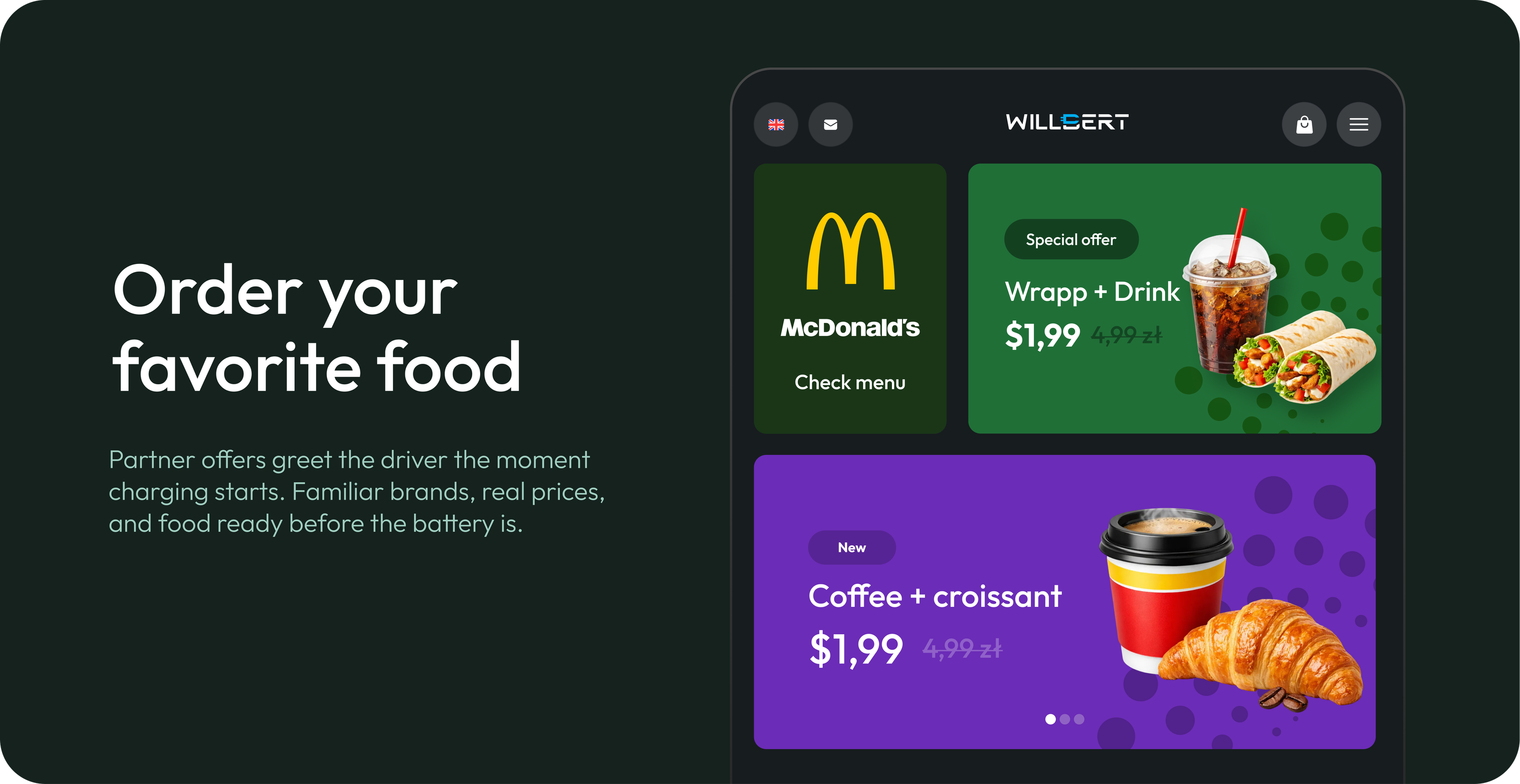
Charging, meet retail.
30 minutes remaining. Hungry?
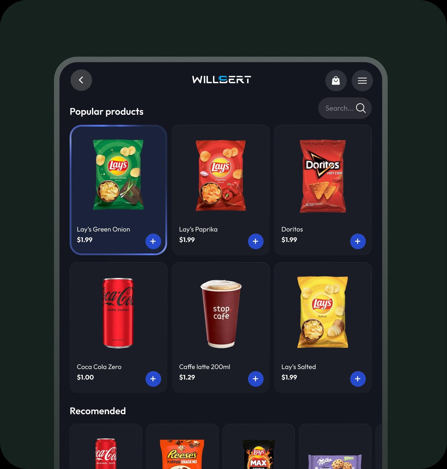
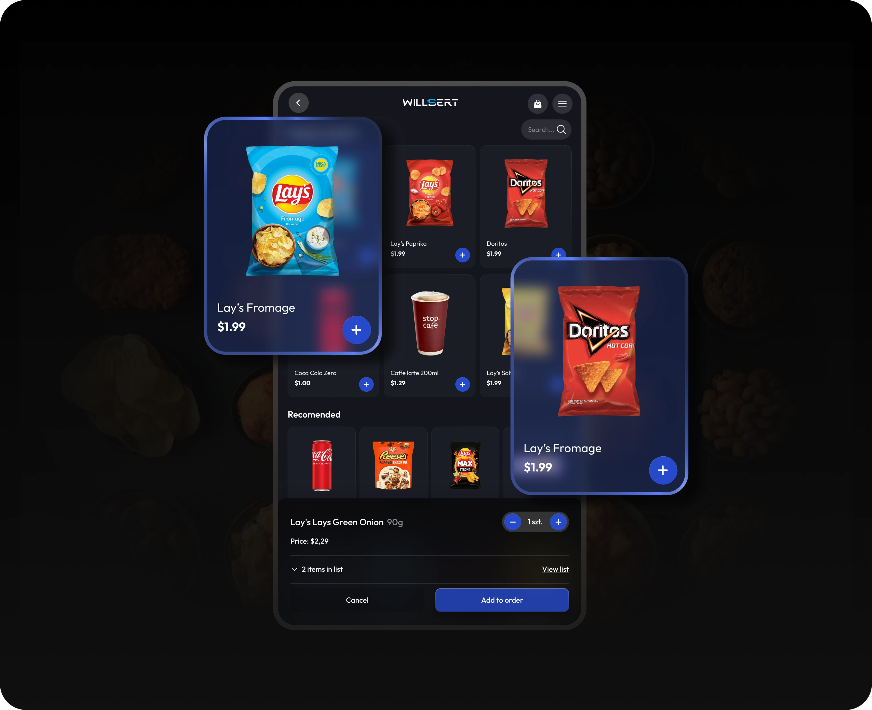
A store that fits in the wait
Snacks and drinks in a grid the driver already knows from delivery apps. Search, tap, done — no learning curve for a 30-minute stop.
Details without the detours
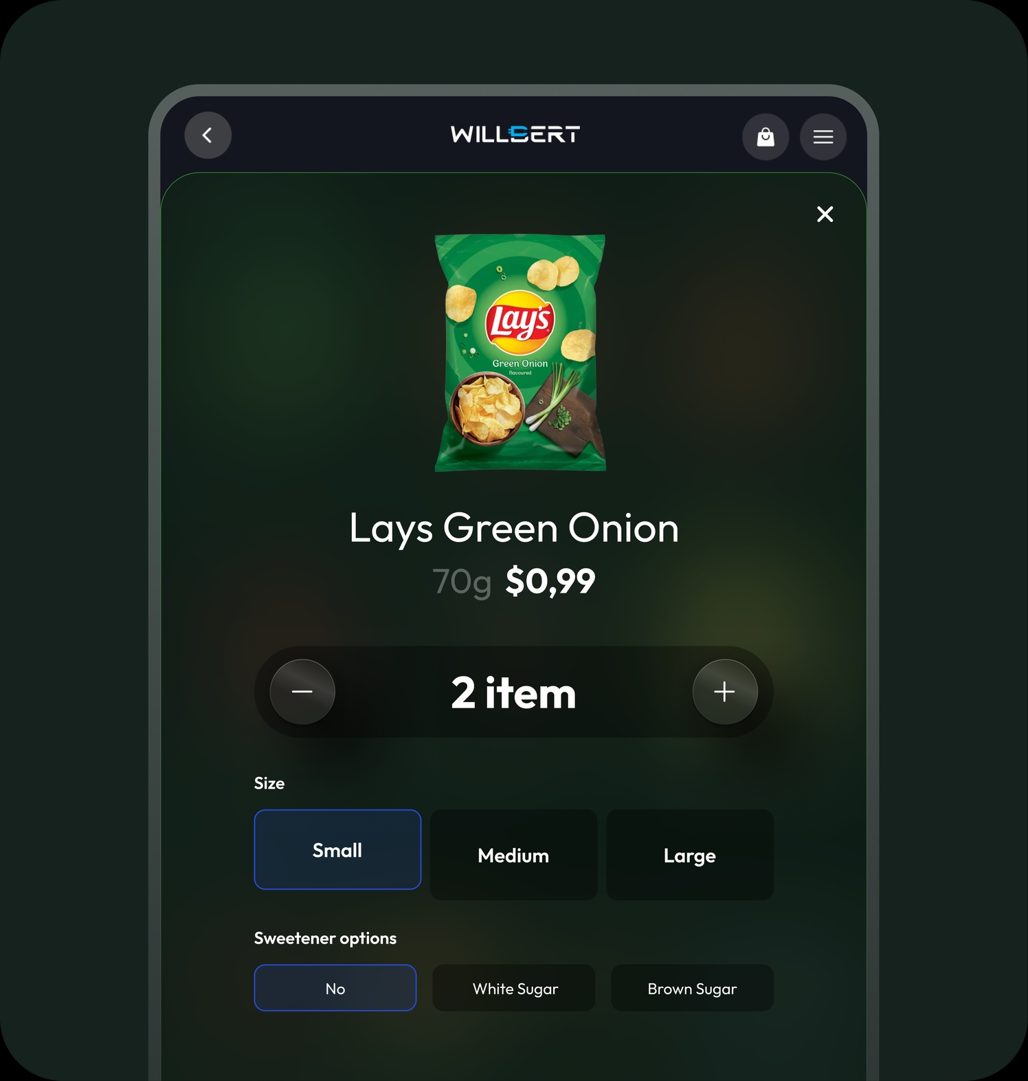
Size, quantity and options on a single card. Two taps from craving to cart.
EV charging stations involve one of the hardest UX moments in all of e-commerce: the user is standing next to their car, often in the rain, with a dozen or so seconds to pick a connector, choose a payment method and move on. On top of that, Willbert ships as a white-label product — the same interface runs under different partner brands, so every decision had to work equally well whatever logo is on the screen. I designed the entire flow — from connector selection through payment to a live session-cost preview — as one coherent system rather than a set of separate screens to adjust by hand.