Aurora

Premium real estate agency

// Year
2026
// Role
UI Design & Front-end
// Tools
Figma, Next.js, GSAP, Tailwind CSS
View demo
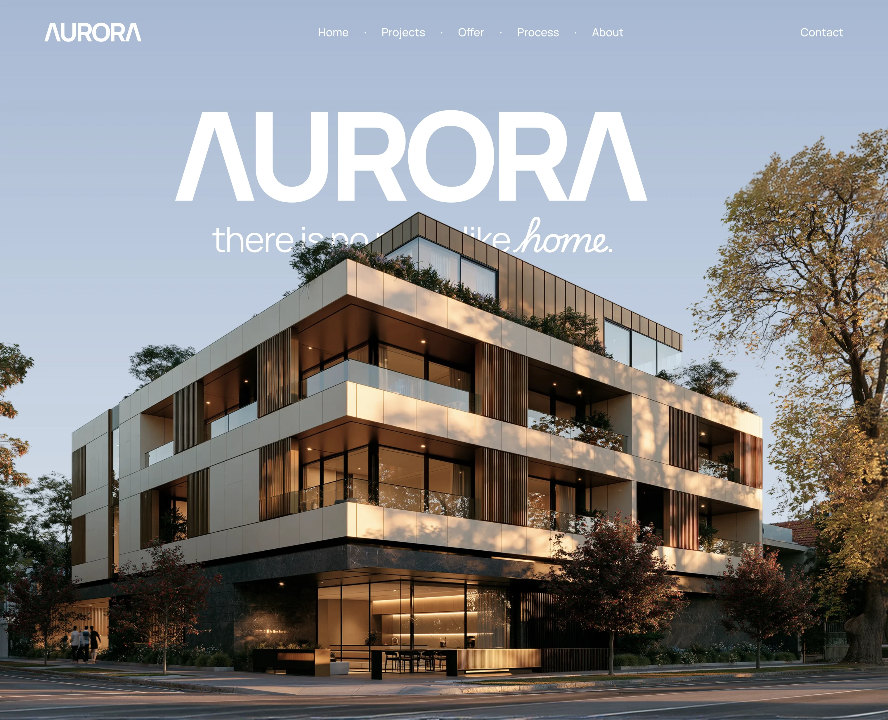
Hero — the AURORA wordmark over the building and the line “there is no place like home”
The studio’s description panel, sliding up at the end of the hero sequence
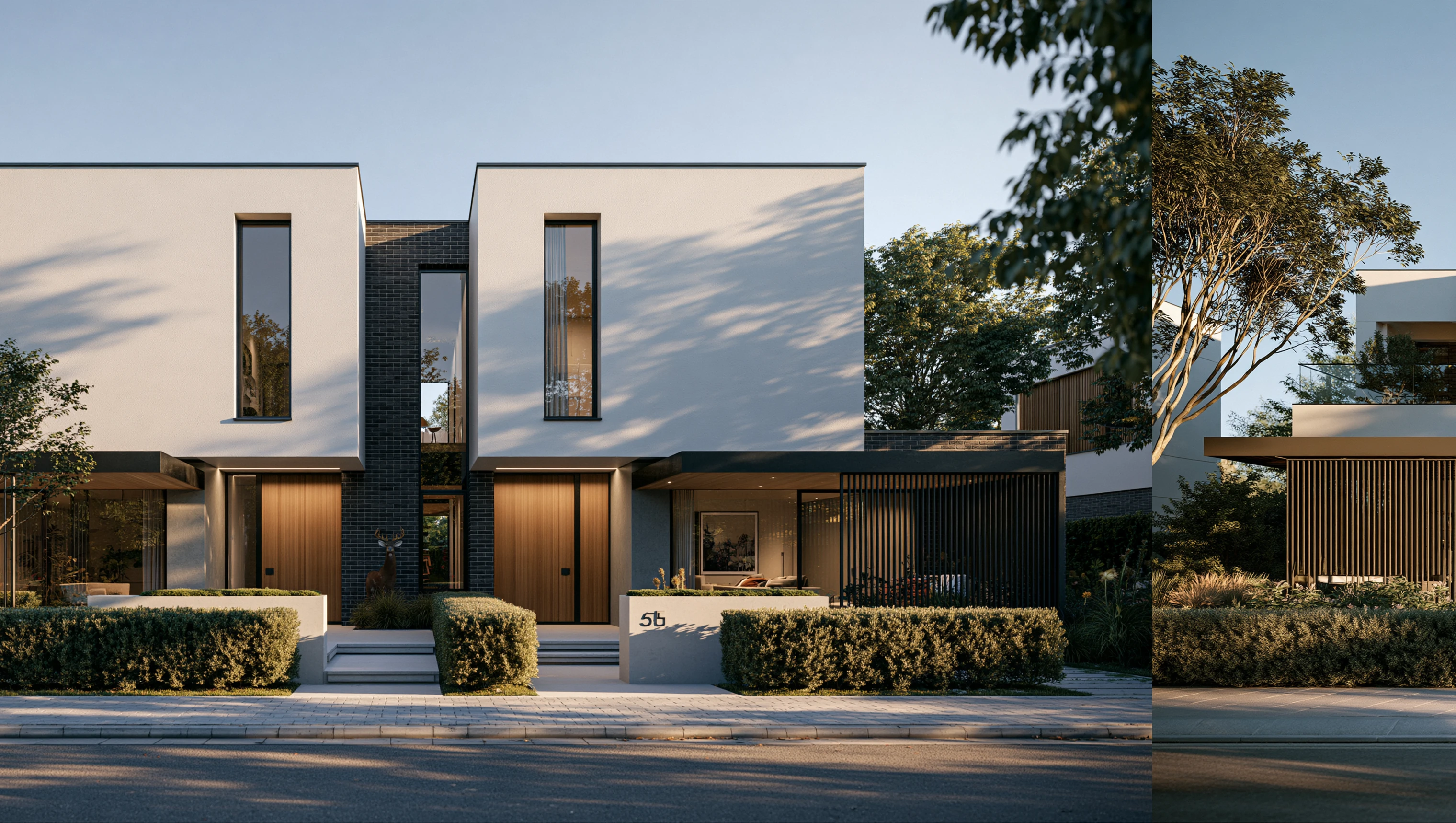
A horizontal slider of the development — two frames side by side
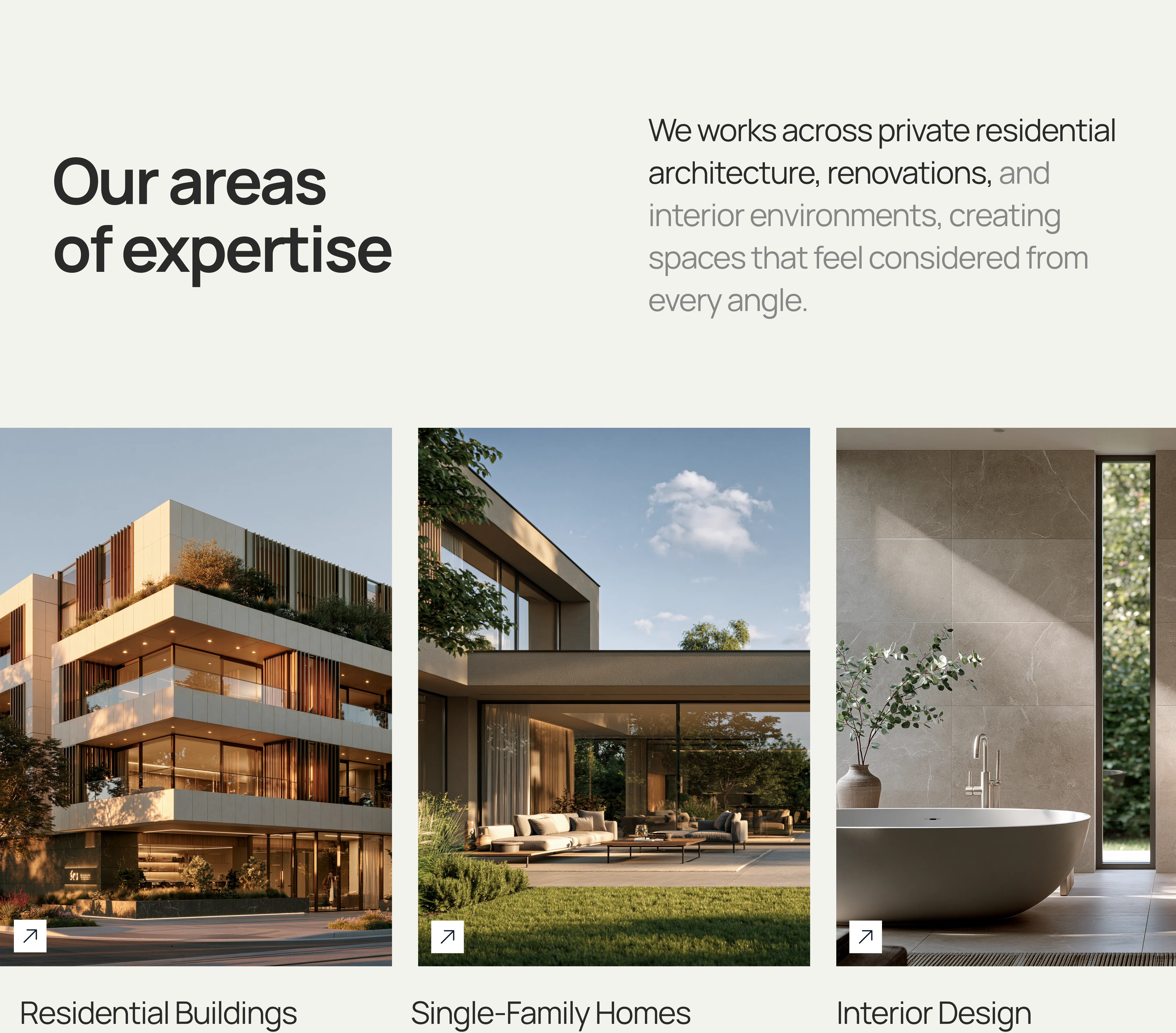
The “Our areas of expertise” section with the three fields of practice
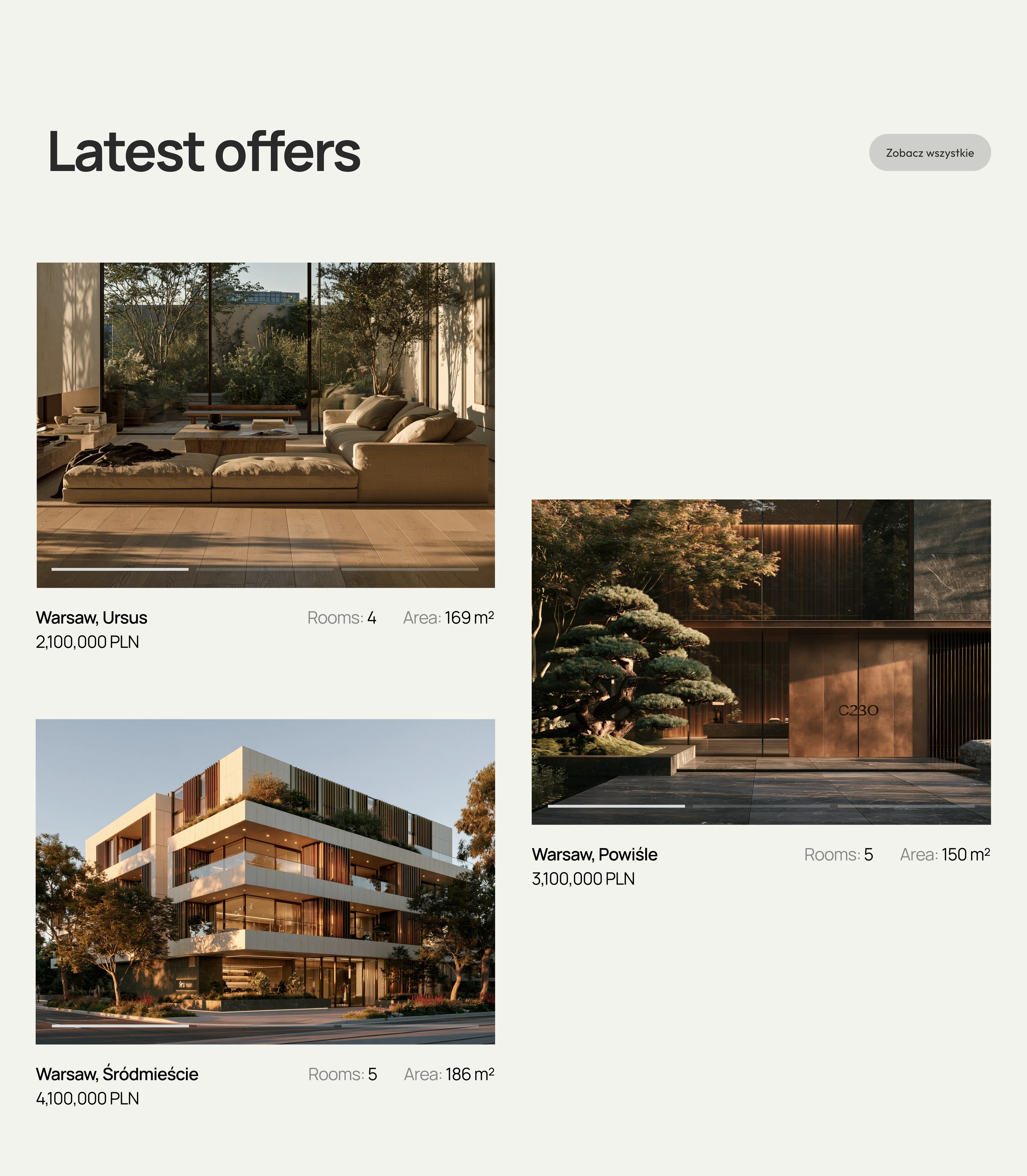
“Latest offers” — apartment cards with price, number of rooms and floor area
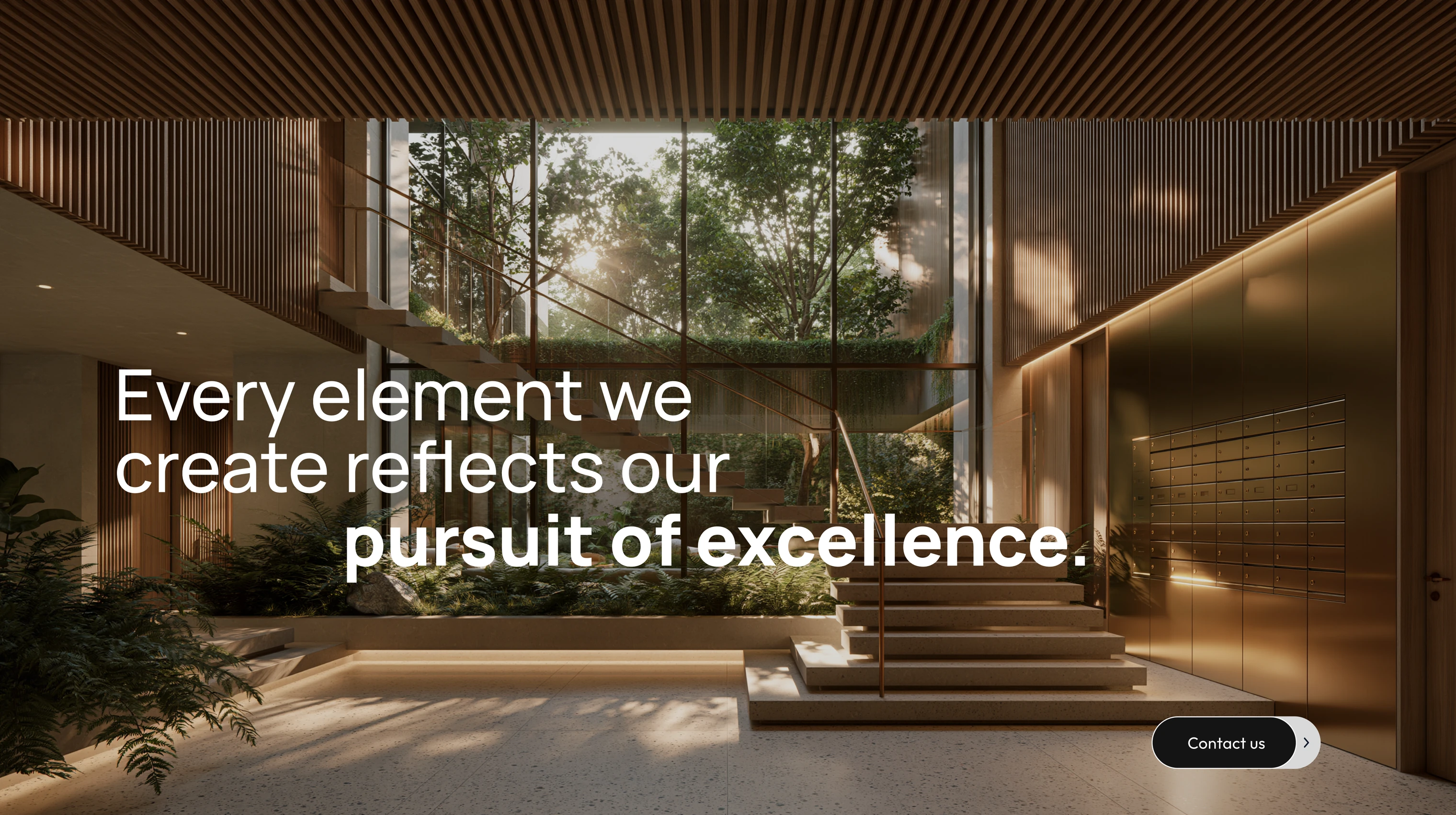
A full-bleed section reading “Every element we create reflects our pursuit of excellence”
The line “Your Premium Interior” spreading apart on scroll
The “Meet an Interior Design Expert” card over an interior shot
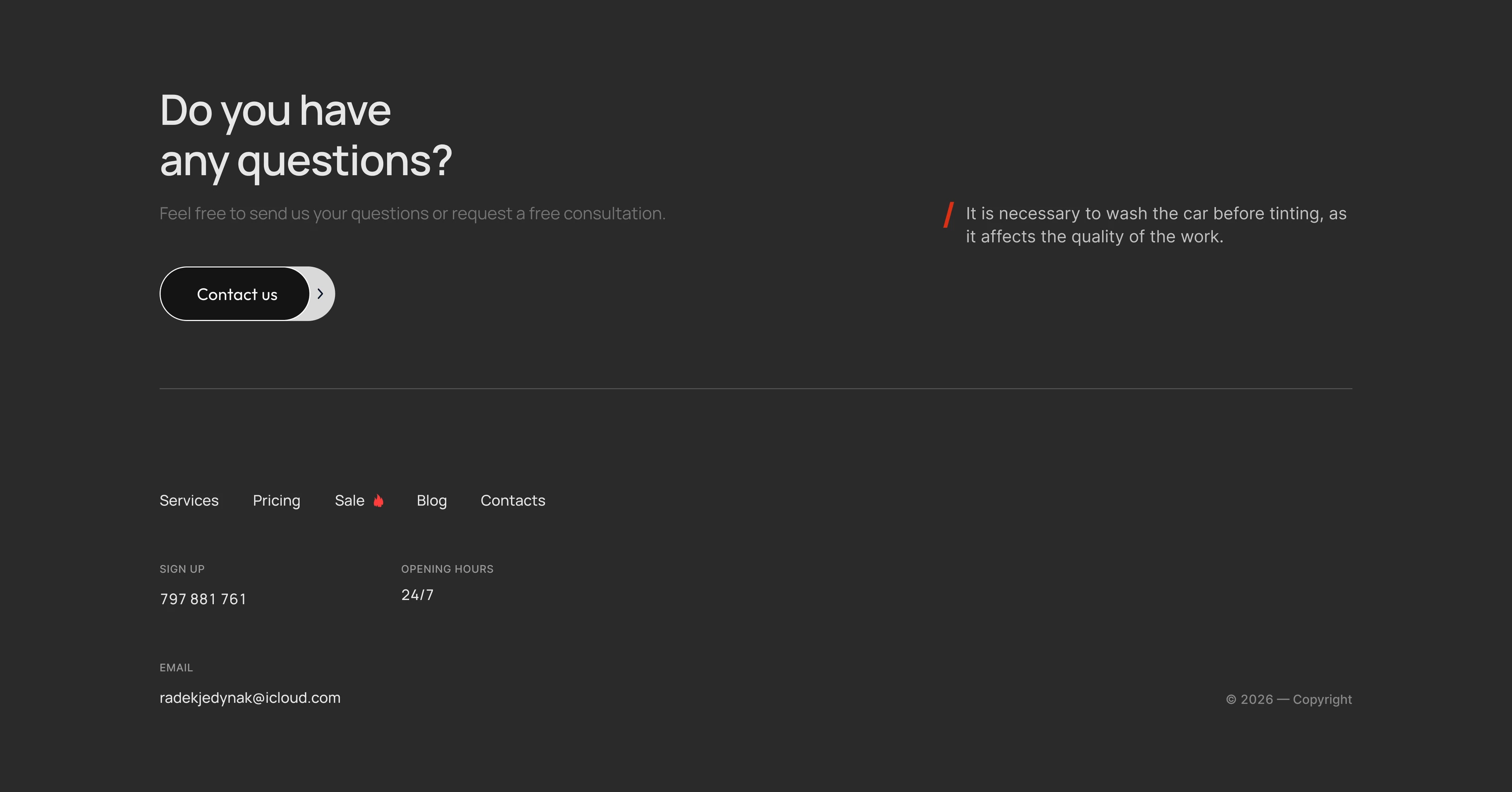
The footer with the contact section and details
// Context

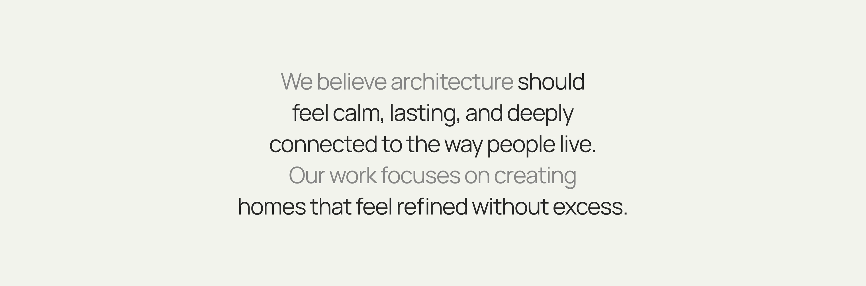
Architectural renders sell through movement, and most developer sites lay them out as a grid of tiles. Aurora does the opposite: the development's name sits underneath the building and is only uncovered once scrolling slides the building down, and every section after it has its own way of entering the frame. I designed the site in Figma and built it myself, because with a layout like this a mockup cannot answer the question the whole effect rests on — how much scroll each moment gets.

// Impact
Sections
8
Scroll-driven scenes
6
Scope
Figma → code
// See also

Have a similar project in mind? Drop me a few lines — I’ll get back to you within 24 hours.

Get in touch