Brand identity
I design a logo together with the rules for using it: colours, a typeface and brand guidelines. They make your business look the same on the website, on a business card and as an icon on a phone.
- Logo
- Colour
- Typography
- Brand guidelines
A logo is only the beginning
A brand identity is a logo together with the rules for using it. Without them, everyone who makes a flyer, a post or a sign for you has to guess. With them, your brand looks the same no matter who prepares the material.
A mark in several versions
Horizontal, stacked and the symbol on its own, in colour and in one colour. Every place gets a version that fits it and looks right.
Colours and a typeface
A palette with values for print and screen, and a typeface for headings and body text. Every material speaks with one voice.
A graphic element
A pattern drawn from the mark. It fills backgrounds, covers and packaging, so the brand is visible even without the logo in the frame.
Brand guidelines
One document with the rules for the print shop, the agency and new employees. Nobody has to ask how to use the logo.
Without rules, a brand drifts apart on its own
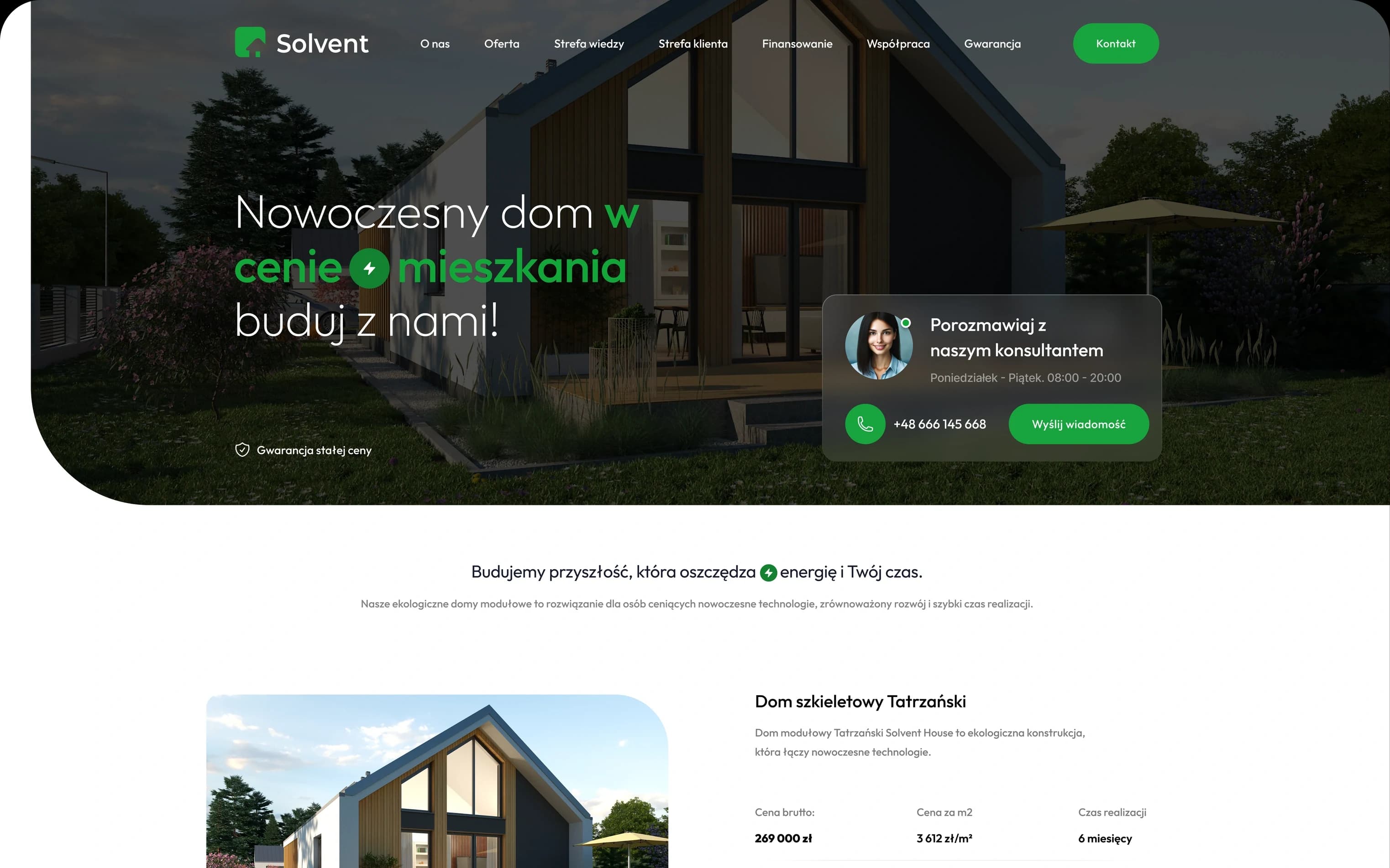
One person makes the website, another the business cards, a third the posts. Each takes the logo from a different file and picks the colour by eye. Switch to see the same four places with brand guidelines.

- 4 shades of green
- 3 different typefaces
- The logo stretched, rotated and on a weak background
A simple mark that says something
Solvent builds modular houses. The mark combines two simple forms: a rounded square and a house cut out in negative space. The roof reaches past the edge of the square, so the mark does not look like a closed box.
Building the symbol
Every measurement comes from one module: the side of the square, a. That way the mark can be rebuilt at any scale and nobody draws it by eye.
- Corner radius
- r = 0.19 a
- Roof pitch
- 45°
- Roof thickness
- 0.09 a
- Door width
- 0.145 a
One logo, every place
The mark has three layouts and six colour versions. Every background and every format gets a variant that keeps contrast and legibility.
Three layouts
Horizontal is the default. Stacked suits near-square formats, and the symbol alone suits small spaces.
HorizontalDefault
StackedSquare formats
SymbolSmall spaces, icons
Six colour versions
There is one rule: pick the variant with the highest contrast against the background. The one-colour versions also work on a stamp and in single-colour print.
- Full colour, light background
- Full colour, dark background
- White on the brand colour
- Black, one colour
- Full colour, deep green
- White, one colour
Size test
Move the slider. Below 110 px the full logo loses its detail, so the symbol takes its place. The symbol reads from 24 px, and as a browser tab icon even at 16 px.
In print: the logo from 25 mm, the symbol from 8 mm.
- Browser tab · 16 px
- iPhone home screen
- Facebook profile
Colours by the numbers, not by eye
Every colour has values for screen (HEX, RGB) and for print (CMYK, Pantone). The print shop, the developer and the agency get the same numbers, so the green on the website and on the business card is the same green.
- Primary colour
Solvent Green
- HEX
- #18A53D
- RGB
- 24 · 165 · 61
- CMYK
- 82 · 0 · 92 · 0
- Pantone
- 355 C
- Primary colour
Ink
- HEX
- #0A0A09
- RGB
- 10 · 10 · 9
- CMYK
- 60 · 50 · 50 · 100
- Pantone
- Black 6 C
- Secondary colour
Deep Green
- HEX
- #0C4A21
- RGB
- 12 · 74 · 33
- CMYK
- 88 · 35 · 95 · 45
- Pantone
- 3435 C
- Background
Paper
- HEX
- #F4F3EE
- RGB
- 244 · 243 · 238
- CMYK
- 3 · 2 · 6 · 0
- Secondary colour
Mint
- HEX
- #DDF2E2
- RGB
- 221 · 242 · 226
- CMYK
- 10 · 0 · 10 · 0
The CMYK and Pantone values are the closest matches. They are checked on a print proof before production.
Plus Jakarta Sans
One typeface for headings, body text and marketing materials. Geometric, with open shapes, it sits well next to the wordmark. It is free (Google Fonts, OFL licence), so the business pays nothing for a licence.
- Regular
- Medium
- SemiBold
- Bold
A modern house for the price of a flat
Compare first, get in touch later
The model card shows the gross price, the price per square metre, the build time and the floor area before anyone asks for a phone number.
Knowledge · Blog
A brand you recognise from a single frame
The roof chevron taken from the mark forms a pattern for backgrounds, covers and packaging. The brand is visible even when the logo is not in the frame.
Brand guidelines look after the brand when I am not around
The print shop, the social media agency and a new employee all get one document with the rules. The logo will not be stretched, recoloured or placed on a background where it disappears.
- Wrong
01Do not distort the proportions
- Wrong
02Do not rotate the mark
- Wrong
03Do not change the colours
- Wrong
04Do not rearrange the elements
- Wrong
05Do not add effects
- Wrong
06Do not use a low-contrast background
- Wrong
07Do not change the typeface
- Wrong
08Do not resize the elements
From the business card to the envelope
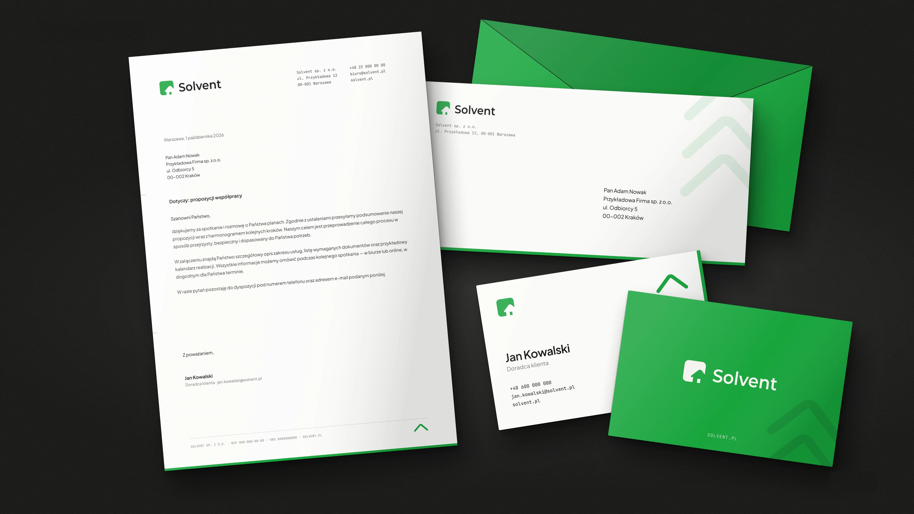
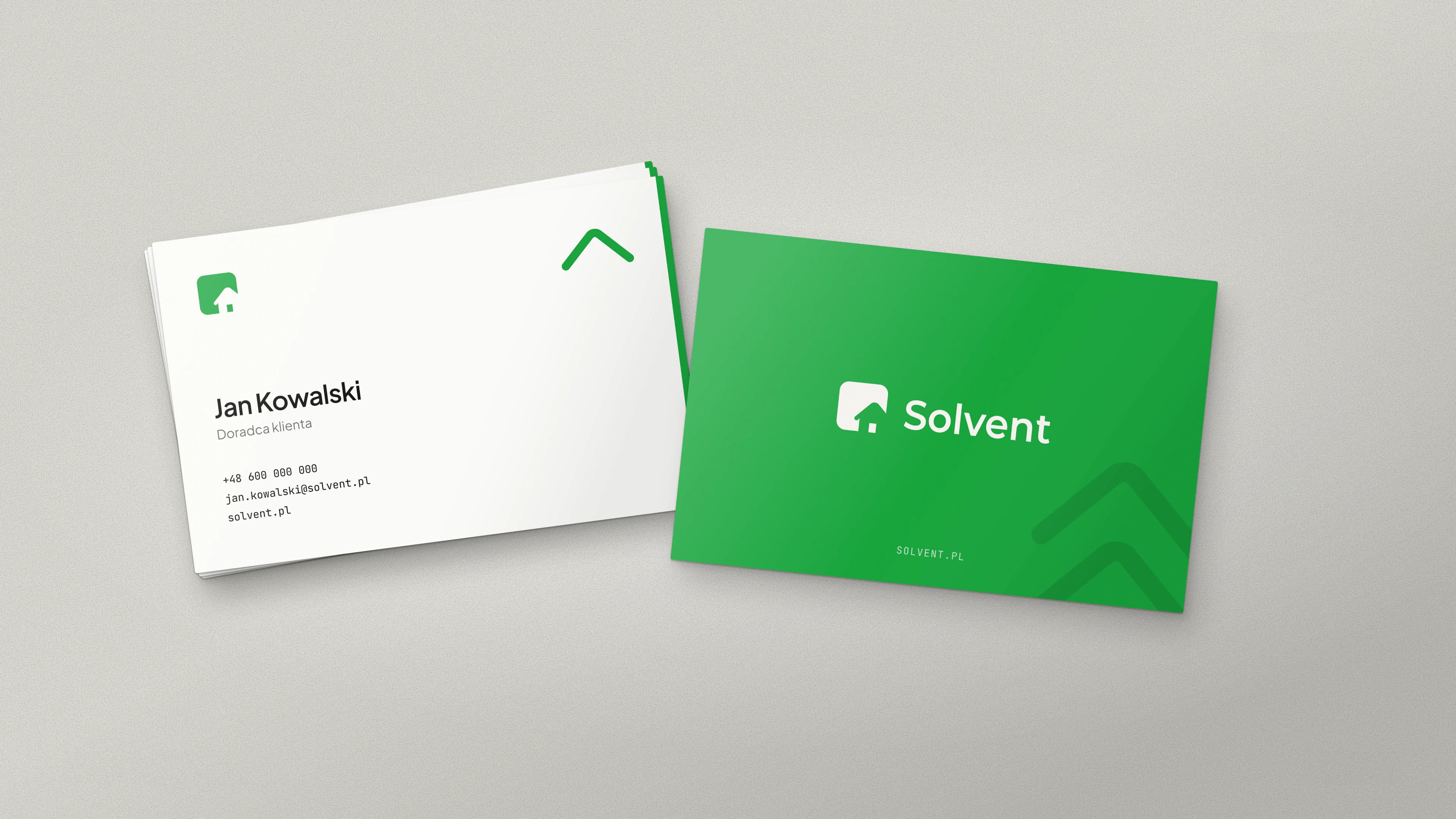
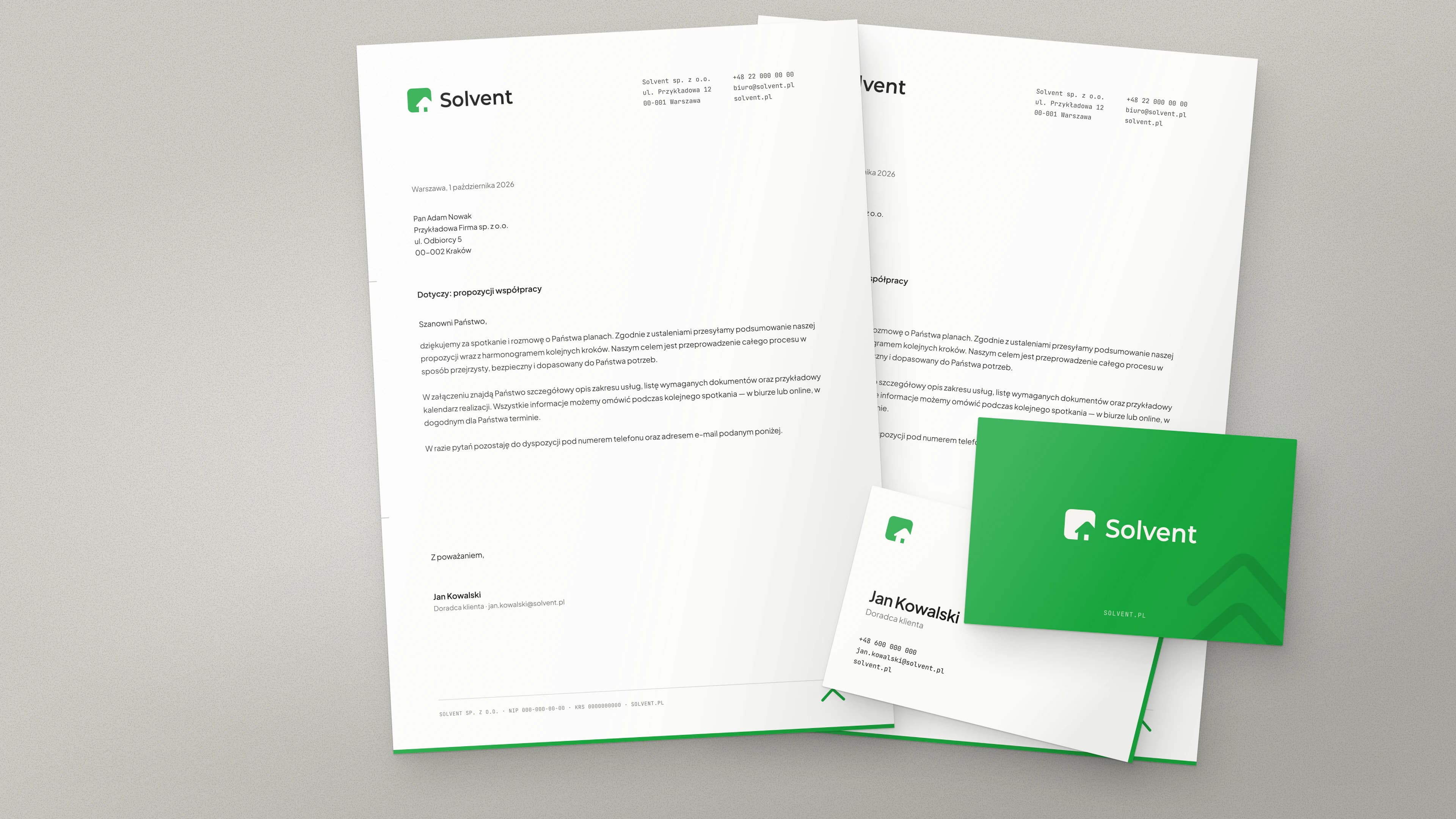
A brand identity ends with files you can take straight to the print shop. This is the stationery from the Solvent brand guidelines.
From the first conversation to finished files
- 01
Conversation
I ask about your business, your customers and your competitors. We agree what the brand should say and where it will be used: on the website, in print, on a vehicle.
- 02
Directions
I show directions for the mark already in use: on the brand colours, on a photo and at a small size. You never pick a logo from a blank page.
- 03
Refinement
I take the chosen direction all the way: construction, versions, colours and typeface.
- 04
Guidelines and files
You get the brand guidelines and a full set of files, ready for the print shop, the developer and the agency.
Not every direction wins
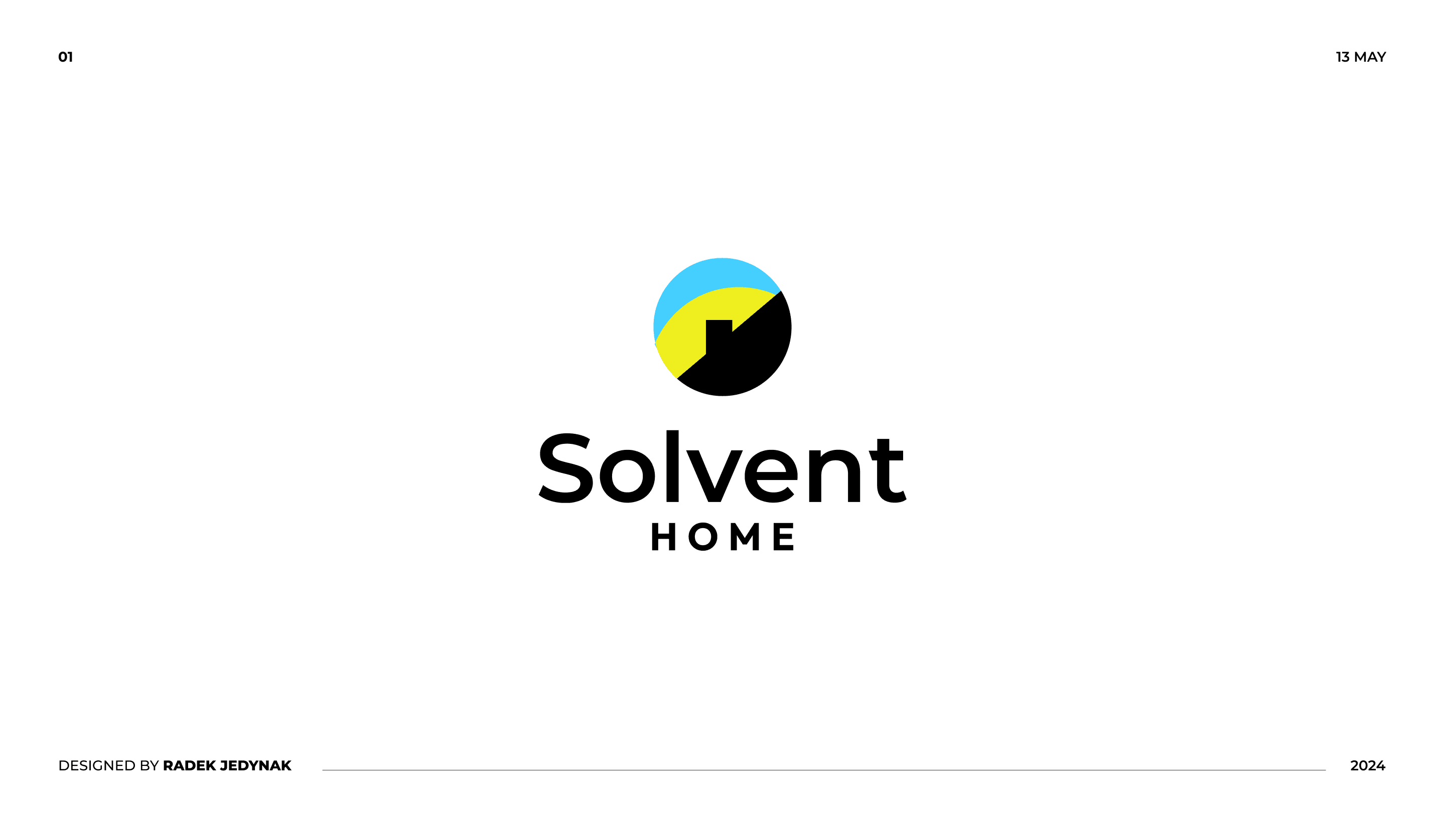
One of the directions for Solvent was a circle with a roof in blue, yellow and black. The client chose another one, and that is normal. That is why I show directions first and only take the chosen one all the way.
What the Solvent identity includes
- Horizontal and stacked logo, and the symbol
- Six colour versions
- A palette with HEX, RGB, CMYK and Pantone values
- A typeface and a type hierarchy
- A graphic element and a pattern
- Brand guidelines with usage rules
- Business card, letterhead and envelope
I will fit your scope to what your business actually needs.
Before we start, you will probably ask about this
How much does it cost?
I price every project individually, depending on its scope and complexity. After a short conversation I will prepare an offer that fits your needs.
How long does a brand identity project take?
It depends on the scope: a logo alone is less work than a logo with brand guidelines and stationery. After our first conversation I give you a specific deadline and stick to it.
Will the logo work at a small size and on a dark background?
Yes, that is part of the project. The mark gets a horizontal and a stacked version, the symbol on its own, and versions for light, dark and coloured backgrounds. Before it goes into the guidelines, I check it at icon size.
What do I get at the end?
Brand guidelines and logo files for print and screen, a palette with HEX, RGB, CMYK and Pantone values, and a typeface. We agree the scope at the start, so you know what you will get before we begin.
How do feedback and sign-off work?
I show the directions and collect your comments. I only refine the one you approve, so nothing surprises you at the end.